Wednesday, November 26, 2014

Post #10

Compare and contrast vector graphics and pixel images. 
Vector graphics are based off lines and geometric figures. The size of the image can be resizable without losing picture quality or getting blurry. Pixel images are based off pixels. They will get blurry or lose quality if you resize it.

What resolution is necessary to print raster images?
The resolution that is necessary to print raster images is 300 DPI.

What resolution is necessary to display raster images on the internet?
The resolution that is necessary to display rester images on the internet is 72 DPI.

Post #9

Who is Steve Jobs?
He is the founder of the company named Apple, which is most famous for their computers, music players, and mobile devices.

What company was he CEO for many years?
He was the CEO for Apple Inc. for many years.

What did he do for the computer industry?
He created a computer that could compete and go against Microsoft Windows. 

How did this man impact the graphic design industry?
His computers had a software that could create graphic design. With the availability of this program, graphic designers have more flexibility and options to use graphic design software.

Post #8

Why must designers pay close attention to how color is utilized within a composition?
Designers need to pay close attention to how color is utilized within a composition so they know which places need to stand out to emphasize its intended message that it is telling to the viewer. 

Why is the color wheel an important tool for graphic designers?
The color wheel is an important tool for graphic designers because it is convenient for them to use when choosing colors.

Find an example of neutral colors utilized within a design (hint: google poster design). Near the sample, discuss why you feel the designer included neutral colors within the composition.
The designer included neutral colors within the composition to give off the "simplistic" vibe of the art work. It also gives it a comforting feeling to look at.


Briefly describe how we "see" the color of an object?
Light is reflecting into our eyes, allowing us to see colors that are in front of us.

Post #7

Describe white light? 
White light is a combination of all colors of light.

How do we see color if objects "have no color of their own"?
We see colors if objects "have no color of their own" because certain wavelengths reflect light on the object that has "no color", making us see that there is color.

What seven colors result when white light is refracted through a prism? 
The seven colors result when white light is refracted through a prism are red, orange, yellow, green, blue, indigo, and violet.

Describe hue? 
Hue is a color in its most pure form.

What happens with white?
White is when all colors mixed together reflect light in our eyes.

What happens with black?
Black is when there is when all the colors are being absorbed, making us see no light in our eyes.

How color is perceived depends on what?
Color is perceived depending on how much colors are being absorbed or reflected, and how we perceive that light in our eyes.

What is a color wheel? 
A color wheel is a combination of all colors in a circle, including their hues, tints and shades.

What are primary colors? Name them?
Primary colors are colors that can be combined to create a larger range of colors. The 3 main primary colors are red, yellow and blue. 

What are secondary colors? Name them? 

Secondary colors are colors made by mixing two primary colors. The 3 main secondary colors are orange, green and purple.

What are tertiary colors? Name them? 

Tertiary colors are colors made by mixing two secondary colors or one primary color and one secondary color. Tertiary colors include yellow-green, yellow-orange, red-orange, red-purple, blue-purple and blue-green.

What are neutral colors? How can they be created? 

Neutral colors are colors that don't show up in the color wheel. Those colors include black, white, grey, and sometimes brown and beige. They can be made by mixing a variation of combinations to make up these colors.

How can a neutral color help a design?
Neutral color can help a design by having an area that is pleasing to the eyes of the viewers.

What are complementary colors? Name them? 
Complementary colors are made by combining two colors that complement each other to emphasize something. Colors that complement each other are red and green, orange and blue and yellow and purple.

What is color value? 
Color value describes how light or dark a color is.

What is a shade? 
Shade is any color with black added to darken hues.

What is a tint?
Tint is any color with grey or white added to lighten hues.


What is saturation/intensity?
Saturation/intensity shows how vivid a color is.

What happens when you mix complementary colors together? 
When you mix complementary colors together, you will get grey.

What is a color scheme? 
A color scheme is an arrangement or combination of colors.

Describe a monochromatic color scheme? 
A monochromatic color scheme is an arrangement or combination of colors of a single hue.

Describe an analogous color scheme? 
A analogous color scheme is an arrangement or combination of colors that are next to each other on the color wheel.

Describe a complementary color scheme?
A complementary color scheme is an arrangement or combination of colors that complement each other.

Describe a split-complementary color scheme?
A split-complementary color scheme is an arrangement or combination of colors that includes a base color and two colors that are adjacent to the base.

Describe a triadic color scheme? 
A triadic color scheme uses three colors equally spaced apart around the color wheel.

What colors are considered to be warm colors? 
Colors that are considered to be warm colors are mainly red and orange.

Describe the psychology of a warm color scheme?
The psychology of a warm color scheme is that they are bold and vivid, making the picture look overwhelming.

What colors are considered to be cool colors? 
Colors that are considered to be cool colors are white, grey, blue, and green.

Describe the psychology of a cool color scheme?
A cool color scheme makes a composition calm like nature and pleasing to the eye.

Why is important to consider which colors are being used within a design?
It is important to consider which colors are being used within a design so viewers can understand the message that you are trying to tell them within the artwork. With the use of all these techniques of color schemes, complementary colors and warm and cool colors, the message will be clear to viewers to what you are trying to tell the audience and make them feel a certain emotion.

Sunday, October 12, 2014

Post #6

What is the pen tool used for?
The pen tool is used to make shapes in art of design by using straight lines or curves.

How can you manipulate a path/line in Illustrator? Discuss the use of the white arrow tool. Pen+, pen-,and convert tool.

One can manipulate a path/line in Illustrator by clicking and dragging it with the direct selection tool (white arrow tool). You can add more pr delete anchor points in a path/line by using the Pen+ or Pen- buttons. The convert tool curves and shifts the anchor points to the desired size/location.

How can you utilize the layers palette in Illustrator?

I can utilize the layers palette by putting each figure in each layer. The layers palette help organize the order of where certain objects are placed. 

How do you create a clipping mask in Adobe Illustrator?

You create a clipping mask in Adobe Illustrator by clicking on a figure and click on the "clipping mask tool" to mask it. 

Post #5

For each of the 5 elements of design (shape, line, texture, space, value), find an example that utilizes each element within the design (Google search for poster design, advertisement, etc.). You should have 5 DIFFERENT sample designs.  For each, evaluate the design in 4 to 5 sentences.  Label each with the appropriate element.  Then, discuss how that particular element is used and how it enhances the design.

Shape
In this piece of artwork, each figure is made out of different shapes to become into one. You can easily tell that there are 2 figures in this artwork even with all the little pieces that make up each figure. The bigger shapes bring more attention than the smaller shapes. They are easier to notice and build more smaller shapes on top of it.

Line
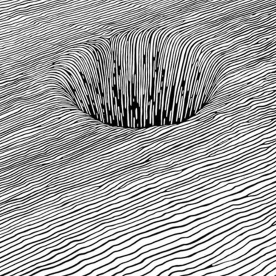
This artwork's main focus are lines. Areas that have less space in between lines simulate the darker areas of the photo. Darker areas of the picture are easier to notice than areas with lines with more space in between. While adding curves, more dimension is added into the artwork.

Texture
Texture is another important factor, because it gives off a "vibe" or a "feeling" to a picture. It can also emphasize a certain "theme" that an artwork is going for. The details of the texture can help you imagine the texture's touch. This picture gives us a feeling that this surface feels like a bunch of ropes.

Space
Space helps the viewer guide their eyes to the most important(s) part of the picture. It is the part that outshines every other part of the picture. This piece of art work shows that there are two different colors in the background, which is black and white. In the white section, the black pattern represents birds, making the white section representing the sky. The bird pattern soon transitions into a black background, which translates to water to compliment the white spaces which are fish.

Value
Value gives a picture dimension. It can help the viewers imagine the width, length, and height of a certain graphic on the photo.  It also gives illusions on how far something looks, to compliment reality. This picture shows off the curves and size of the sphere. 

Post #4

Why/how can icons be used to communicate? 
Sometimes not everyone can read the text that are signs. One thing that everyone can understand are pictures. Icons are simple images that everyone can understand so it is easier for people such as foreigners in another country to find their way or being able to understand certain restrictions within a certain area.

Via the internet, find 2 examples of common icons that clearly communicate their message.  Post both in this entry and explain your choice. 

This icon is the handicap icon. This graphic shows a person on a wheelchair who would most likely be handicapped. It is seen everywhere such as public buildings and businesses.

These icons are signs used in bathrooms which are also in public buildings and businesses. They help differentiate male and female.

What is the difference between copyright and public domain? 
When a something is being copyrighted, one would need permission to use someone else's work. A public domain does not need permission from the original creator to use their work.

How can you avoid plagiarism in this class?  In other classes?
How I can avoid plagiarism in this class and other classes is to not cheat or to copy someone else's work. If I do plan to take something from another source, such as the internet, I would need to credit them to avoid legal trouble. Especially when quoting an article, it is important to paraphrase or quote their text.